I have just visited YouTube and noted they have a new user interface.
This is the first time I have seen this design, and no one in my circle has mentioned it to me.
At a glance, you cannot help but notice the difference from the old layout we have been accustomed to for years.
At the moment, I am using Google Chrome Version 125.0.6422.142 on a Mac.
If you have the same hardware and browser version but no new layout, it means Google is still rolling out this UI in phases or just trying it out to get feedback.
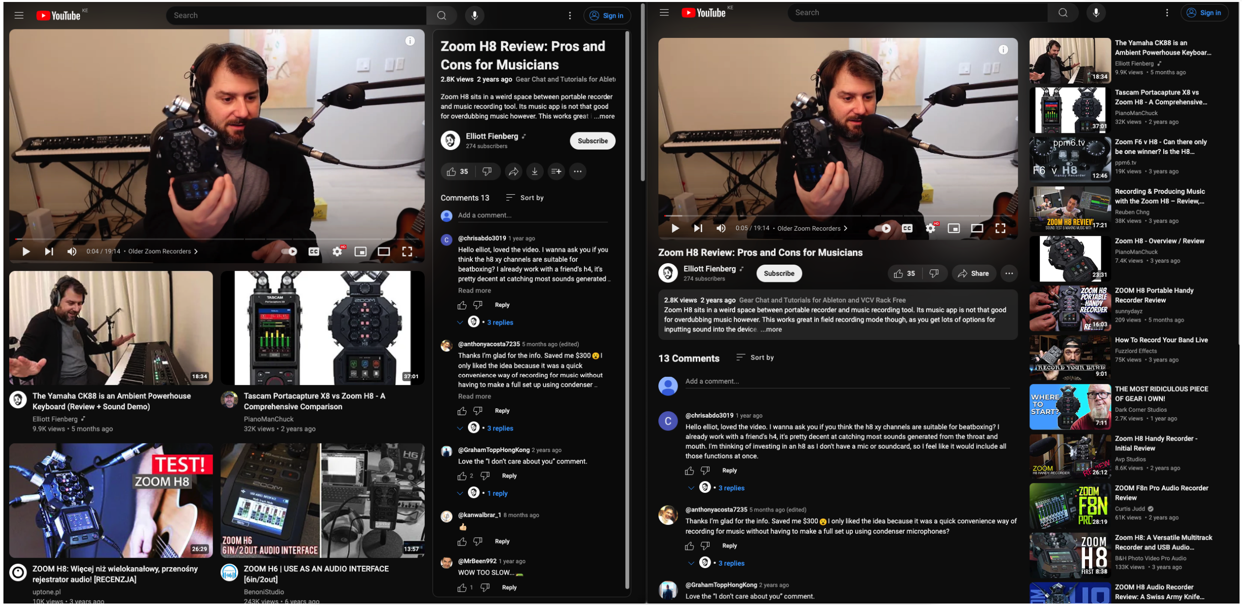
Here is a screenshot of what the new YouTube layout looks like.
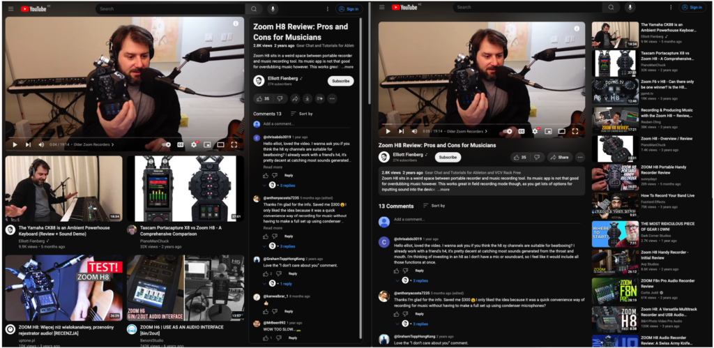
Differences between the old and new YouTube layouts
When playing a video in the Default view, it takes up a larger screen compared to the old UI.
In the new UI, the title, video description, channel name, and comments are on the right-hand side of the playing video in the Default view.
When playing a video in Theater mode on a computer in this new layout, the video and channel details, and comments still show up on the right side of your screen
Recommended and suggested videos show up below the currently playing video in the new YouTube layout
Compared to the old layout, where the video details and comments were below the currently playing video and recommended videos on the right, the recommended videos in the new UI have larger thumbnails
In the meantime, I will be using this new layout and find out if I like it.
Otherwise, I will write another post on how to go back to the old YouTube layout.